
今回はコピペができてすぐに使えるCSSボタンについて解説していきます!
初めは、シンプルで使いやすいデザインのものを中心に、最後は遊び心のあるデザインを入れていますので是非参考にしてみてください!
テーマや既存のCSSによっては見え方が多少異なる場合があります。その都度調整をお願いします。
基本のボタン
<a href="" class="btn_01">Button</a>
a.btn_01 {
	display: block;
	text-align: center;
	margin:0 auto;
	text-decoration: none;
	width: 200px;
	padding: 1rem 4rem;
	font-weight: bold;
	border: 2px solid #ef6b20;
	color: #ef6b20;
	transition: 0.5s;
}
a.btn_01:hover {
	color: #fff;
	background: #ef6b20;
}
角丸ボタン
<a href="" class="btn_02">Button</a>
a.btn_02 {
	display: block;
	text-align: center;
	margin:0 auto;
	text-decoration: none;
	width: 200px;
	padding: 1rem 4rem;
	font-weight: bold;
	border: 2px solid #ef6b20;
	color: #58a5c6;
	transition: 0.5s;
	border-radius: 100vh;
}
a.btn_02:hover {
	color: #fff;
	background: #ef6b20;
}
グラデーションボタン
<a href="" class="btn_03">Button</a>
a.btn_03 {
	display: block;
	text-align: center;
	text-decoration: none;
	width: 200px;
	margin: 0 auto;
	padding: 1rem 4rem;
	font-weight: bold;
	background-image: linear-gradient(90deg, rgba(247, 93, 139, 1), rgba(254, 220, 64, 1));
	color:#fff;
	transition: 0.5s;
}
a.btn_03:hover {
	opacity: 0.7;
}
矢印のついたボタン
<a href="" class="btn_04">Button</a>
a.btn_04 {
	display: flex;
	justify-content: space-evenly;
	align-items: center;
	text-align: center;
	text-decoration: none;
	width: 210px;
	margin: 0 auto;
	padding: 1rem 4rem 1rem 3rem;
	font-weight: bold;
	background: #ef6b20;
	color: #fff;
	border-radius: 100vh;
	position: relative;
	transition: 0.5s;
	border:solid 2px #ef6b20;
}
a.btn_04::before {
	content: '';
	width: 7px;
	height: 7px;
	border-top: 2px solid #fff;
	border-right: 2px solid #fff;
	transform: rotate(45deg);
}
a.btn_04:hover {
	background: #fff;
	color: #ef6b20;
}

a.btn_04:hover::before{
	border-top: 2px solid #ef6b20;
	border-right: 2px solid #ef6b20;
}
枠がずれているボタン
<a href="" class="btn_05">Button</a>
a.btn_05 {
	display: block;
	text-align: center;
	vertical-align: middle;
	text-decoration: none;
	position: relative;
	width: 200px;
	margin: 0 auto;
	padding: 1rem 4rem;
	font-weight: bold;
	color: #ef6b20;
	background: #f7cb82;
	transition: 0.3s ease-in-out;
}
a.btn_05::before {
	content: '';
	position: absolute;
	top: -4px;
	left: -4px;
	width: calc(100% - 4px);
	height: calc(100% - 4px);
	border: 1px solid #ef6b20;
	transition: 0.2s;
}
a.btn_05:hover {
	background: #ef6b20;
	color: #fff;
}
a.btn_05:hover::before {
	top: 0;
	left: 0;
}
押せるボタン
<a href="" class="btn_06">Button</a>
a.btn_06 {
	display: block;
	text-align: center;
	vertical-align: middle;
	text-decoration: none;
	position: relative;
	width: 200px;
	margin: 0 auto;
	padding: 1rem 4rem;
	font-weight: bold;
	border-radius: 10px;
	color: #ef6b20;
	border: 3px solid #ef6b20;
	box-shadow: 5px 5px #ef6b20;
	transition: 0.3s ease-in-out;
}
a.btn_06:hover {
	box-shadow: none;
	transform: translate(5px, 5px);
	color: #ef6b20;
}
動くボタン
<a href=""><button class="btn_07">Button</button></a>
.btn_07 {
	display:block;
	background-color: #ef6b20;
	padding: 1rem 4rem;
	width: 200px;
	animation: bn53bounce 4s infinite;
	cursor: pointer;
	border:solid #ef6b20 1px;
	color:#fff;
	margin:0 auto;
}

@keyframes bn53bounce {
  5%,
  50% {
	transform: scale(1);
  }

  10% {
	transform: scale(1);
  }

  15% {
	transform: scale(1);
  }

  20% {
	transform: scale(1) rotate(-5deg);
  }

  25% {
	transform: scale(1) rotate(5deg);
  }

  30% {
	transform: scale(1) rotate(-3deg);
  }

  35% {
	transform: scale(1) rotate(2deg);
  }

  40% {
	transform: scale(1) rotate(0);
  }
}
まとめ
今回は、コピペで使えるCSSのボタンデザインをいくっかご紹介しました!
また今度、もっと沢山のボタンアイデアをまとめて紹介しようと思います!
なにかの参考になれば幸いです。
最後まで読んでくださり、ありがとうございました!
こばやし
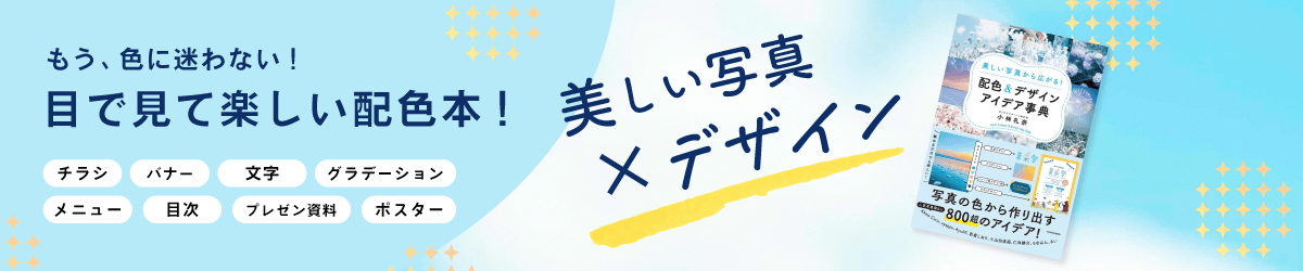
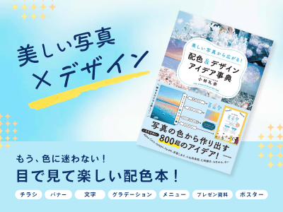
デザイン本が全国の書店で発売中です!
頑張って作ったので、見て頂けたら嬉しいです!

コメント